I’m so excited about this room makeover! Our guest bedroom has been a sad repository for orphan furniture, spare decorative objects, and a mattress on the floor (apologies, overnight guests!) for too long.
I’ve always known I wanted to do something really fun with this room, since our most frequent overnight guest is my adorable little seven year old sister. So while we don’t have any kids of our own yet, it was fun to pull together a kid-friendly guest room that hopefully grown-up guests will also enjoy!

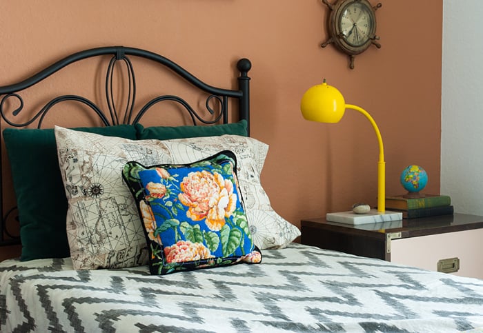
This month, my friends at Ace Hardware challenged me to design a project around their exciting paint color collaboration with OPI Nail Lacquer! They’ve just released three new OPI color collections at the Paint Studio, pairing OPI nail polish colors with coordinating Clark+Kensington shades.
I chose to work with The Natural collection, but I’ll admit, I was a little stumped by the mix of neutral shades and bold, saturated colors. It took me a few restless nights (um, seriously) of color wrestling to land on my plan for the room.
You might recall that I’ve really been loving warm caramel/camel colors lately, and my friend Ashley just did a gorgeous guest room makeover featuring 2/3 walls, so I decided to combine the two, painting the room Alpine Snow (1 gallon interior flat was just enough) and using Adobe Horizon (1 quart interior flat) for a 2/3rds accent wall behind the headboard.
Alpine Snow is a wonderful white – not too warm, not too cold! Maybe my new go-to white wall color? Heads up – there’s also a Clark+Kensington color called Alpine Snow (it’s a very pale periwinkle), so just be sure to specify that you want the one from the OPI collection.
(And you know what? I just realized I never took a “before” photo… Bad blogger! Just picture a pretty small bedroom stuffed pretty full of random objects with walls painted a not-so-pretty taupe.)
Once I had the wall colors decided, I was surprised to find how many accessories I already had that pulled in the bolder hues in the collection. This #thriftscorethursday needlepoint pillow brought in the royal blue of Work of Art and the orange of Blazing Orchid. I’m telling you guys, the thrifting life really pays off!

I’ve had the little campaign nightstand for a few years now. I painted the drawers fronts Mimosas for Mr. & Mrs. – I love the way the peachy pink pairs with the newly-polished brass hardware!
The vintage eyeball lamp was also an old thrift score. It actually was already yellow when I bought it, but it was a terribly uneven spray paint job that was chipping off everywhere. But I did love the retro shape in yellow, so I stripped off the old paint and painted it yellow again. Naturally. Need Sunglasses?

It really was crazy how many pieces I already had on hand. Or maybe a little embarrassing? Or maybe just perfectly fitting that the room that served for so long as the stash for my hoarded treasures ended up adorned with so many of them. Yeah, let’s go with that!
I purchased only four things for this entire room makeover: the two vintage sheets I’m using as curtains, the vintage ship’s wheel clock, two mini frames that I filled with vintage butterfly illustrations, and a curtain rod and clip rings from Target.
I wasn’t sure exactly where I was going with this design, but a loose theme began to emerge…
The “Nautical Naturalist”
A room with a color palette fit for a Wes Anderson set: a little bit nature, a little bit vintage, a little bit world traveler on the high seas (a la Charles Darwin’s voyage of the Beagle; yep, I’m pretty nerdy).
Does it make perfect scientific sense? Perhaps not. Is it whimsical and fun? Absolutely.
My one regret? I have yet to find a vintage pair of binoculars to set on the nightstand.


Seeing everything come together was so rewarding! And so was my slim budget for the space – everything in the room was either thrifted or repurposed, gathered over time. While I don’t recall exact purchase prices for everything, I know it all comes out to under $200!
And I know one little girl who’s very excited about her next sleepover at big sister’s house!
It’s truly amazing what a new color palette can inspire, isn’t it?
If you need some inspiration for your next project, my friends at Ace Hardware are here to help! One lucky reader will win a a $100 Ace Hardware gift card to get you started on your next project!
The giveaway will run through next Wednesday, June 3rd, 12:00am CST. Entry is easy through the Rafflecopter widget below! The winner will be contacted by email and announced within this post as well.
Good luck you guys!
![]()


 |
I couldn’t be more excited to be a member of the Ace Bloggers panel this year and to partner with Ace on this post! Ace Hardware provided me with the materials for this project and I was also compensated for my time and this post. All opinions and positions expressed here are my own and do not necessarily reflect those of Ace Hardware. |
WOW, brynne! such a fun space! you really killed it and kept it fun and so you!
Aw, thank you Cassie! It was really fun to work on and I was really amazed at how much I ended up loving the colors together!
Love this! A unique color combination for sure, but it’s working in this space big time. I really like how you only took the accent wall to about picture rail height. It’s interesting and gives a little more continuity with the rest of the space than full accent walls sometimes do. Looks great! Love the art, too! That you had most of this stuff lying around is not embarrassing–it’s awesome. 🙂
Haha, thanks Brittany! I have new justification for my thrifting habit now – this could be dangerous! 😉
Wow Brynne, you are reall coming into your own style! I love it! I don’t think you are aware of this, but you are a beast when it comes to picking out paint color….you choose colors I would pass up and make it look GREAT. I love the evolution of your style and your blog. This room is gorgeous and I hope you do not mind if I share it.
You are so sweet, Jess! I’m so glad the theme this month really pushed me to choose colors I might not have used otherwise, so I have to give The Paint Studio at Ace credit for a great color collection!
Awww, this room is precious. The butterfly print you found fits perfect over the bed! What a fun, warm, welcoming space!
Thank you so much Jessica! Would you believe I actually had forgotten about that butterfly print?! I only found it when I was clearing out the room to paint it and realized how perfectly it would work!
Oh my gosh, I LOVE LOVE LOVE the space! That bed frame is such a stunna! And are those frames part of the bunch you sent during #swapitlikeitshot?! If so, I’m one lucky gal to have the other set! Love how the gathered room came together, including that 2/3 wall- swoon!
PS. I don’t think the Paint Studio could have come up with a more perfect name for that perfect shade of yellow!
Thanks so much girl! The frames are almost identical but I found them on a separate thrifting trip! I was so glad because I was super tempted to keep the ones I sent you, haha!
GREAT room! love those curtains and how cheery the room is!
Thanks so much Trina! The curtains were a last minute thrift score that worked wonders tying everything together!
oh, wow–what a great space!! I love those sheets as curtains–perfect! And I didn’t realize the butterfly picture was so big when I saw it on facebook–awesome!
Thanks Gretchen! Yes, I love how huge the butterfly art is – I’ve been hanging onto it for months (years, maybe?) waiting to find the perfect place to hang it!
This turned out so perfect! I have an accent wall in my bedroom painted in a similar shade of brown, it is such a pretty warm color to play with in addition to neutrals and pops of color. I really should blog about my bedroom one of these days….
Thank you so much Staci! I’ve avoided any shades of brown paint until now (scarred from brown+beige apartment living, I think), but this one really is an attractive neutral!
Super fun! How did you get your paint lines SO perfect???
Thanks Tara! I’ve discovered that the trick to perfect paint lines is to put down your tape, then do a light line of the base color over the edge of the tape to seal it. Once that’s dry, paint over with the second color. That way, if anything bleeds under the tape (and it ALWAYS does for me, no matter what tape brand), it’s the original base color and it doesn’t matter! Finally, I did use a small craft brush to touch up and make the lines super crisp!
That is genius!!!
So fun! I love all of the earthy tones! They balance so well with the pops of colors. Awesome!
No way! Under $200???? I love it and I really want the butterfly print
I love the vintage feel of the room. I never would have put butterflies and nautical together but it works great!
Cute room! I love the way the campaign chest turned out. Great use of the colors !
Thank you! It ended up being such a fun color combination to work with!
This is so awesome Brynne!! Everything looks so great! I am really in love with the curtains! This is such a great room!!
Thank you so much Katja! The curtains were such a lucky last minute find – I was originally headed in a completely different direction!
Thanx so much for the giveaway. I would love to win. Some paint and new plants would be awsome! !
Good luck Angelica!
I love how this space turned out- great color scheme and cool decor! 🙂
Thanks Stephanie! 🙂
I’m renovating a room into a baby nursery so I need some paint and some tools
I just love the whole room! Everything has pulled together nicely~
I am interested in knowing what the name is on the sheets turned curtains. Do you mind sharing? 🙂
Thanks!
Thank you so much Yvonne! The sheets were made by Fieldcrest, but that’s the only info the label has. I do think they are definitely older since they have that smooth, thin, worn feel of older/vintage sheets.
Really lovely room! Especially the two tone wall, it adds an extra something. The curtains are a gorgeous shade, I’m jealous!
I know I’m late, but BRAVO! The Adobe paint color with the Ikat bedspread could have went South West so fast, but the butterflies and campaign nightstand keep it fresh and modern. The way the green velvet pillows accent those beautiful sheet-turned-curtains-drapes! Plus, you have just justified my need to keep my thrift finds for longer than the year most de-cluttering hints tell you to keep stuff if you don’t use it!! Thank you! Oh, and I still check HSN for the Malachite Sheets you used for curtains in your living room. No luck, yet.
Aw, Candy – thank you so much for your sweet words! Yes, I can always find a reason to justify hanging onto things – perhaps a double-edged sword! 😉
I frequently check for those malachite sheets as well! I can’t believe something so popular is no longer offered, and I haven’t found a perfect malachite fabric pattern yet either… Hopefully someone will fill that void soon!